Test
Para la versión en español, de click aquí.
To validate the effectiveness of my designs, I conducted unmoderated user testing sessions, observing how fans interacted with the prototypes. I gathered valuable feedback on usability, intuitiveness, and overall satisfaction, enabling me to refine my designs further.
Through this iterative design thinking process, I successfully designed a user experience to teach creative writing to teenagers, solidifying my commitment to user-centered design principles.
In this section you will find:
- Empathy Map
- Usability Study
- Affinity Diagram
Empathy Map
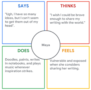
An Empathy Map is a tool to understand someone else’s point of view, their feelings, needs, and challenges. It’s not about you, it’s about stepping into their shoes and seeing the world through their eyes. For this section, I created an Empathy Map based on Maya’s persona, which we found in the empathize section earlier.
Usability Study
Following recruitment of five participants, the unmoderated usability study proceeded. Each participant completed the design-related questions at their own convenience, providing valuable real-world feedback. Conducting such studies allows us to gain user insights and ensure we’re creating something people will genuinely enjoy using.
With feedback from the participants, we were able to create the following graph:
| Participant A | Participant B | Participant C | Participant D | Participant E | |
|---|---|---|---|---|---|
| Finds it easy to personalize | 1 | 1 | 1 | 1 | 1 |
| Finds it easy to register and login | 1 | 1 | 1 | 1 | 1 |
| Knows how to start | 1 | 1 | 1 | 1 | 1 |
| Understands how to take the tests to find the best technique and genre for them | 1 | 1 | 1 | ||
| Finds the community engaging | 1 | 1 | |||
| Feels there should be a reporting button in case something inappropriate is posted | 1 | 1 | |||
| Wants more personalization | 1 | 1 | 1 | ||
| Finds the grammar tips helpful | 1 | 1 | 1 | ||
| Knows where the tracking of the process is | 1 | 1 | 1 | ||
| Finds the privacy settings and parental controls useful | 1 | 1 | |||
| Finds the report button easily | 1 | 1 | 1 | 1 | 1 |
| Likes the anonymous feedback feature | 1 | 1 | 1 | ||
| Feels offline accessibility is important | 1 | 1 | 1 | ||
| Observations | “I want to see more variety in exercises that make it less boring” | Maybe some tips for online safety would be nice | Some timed writing challenges would be fun | “some reading recommendations to improve my writing would be helpful” | “I think it’s important to also learn grammar” |
| Observations | Maybe some contests would make it more exciting | Mentions a mentoring program could be a good idea | I would really like to have the possibility to personalize to dark mode | Says that learning paths that adapt to their needs would be useful | “This platform would need to be carefully moderated. |
Affinity Diagram
UX Affinity Diagrams sort through the data collected in studies and find connections between seemingly random items. It’s a great way to organize thoughts, identify key issues, and make sure the design is something that people actually want and need. The affinity diagram was created after doing an unmoderated usability test with five people. Each color represents one of the people that were tested.
These are, by no means, all the studies done, the competitive report and the usability report, among others are missing from this project, available upon request.
Go back to the UX/UI Design – Cross-Platform Experience page

