Prototype
Para la versión en español, de click aquí.
With a few promising ideas in hand, I transitioned into the prototyping phase, transforming my concepts into tangible representations. I crafted low-fidelity prototypes using paper and sketches, allowing for rapid iterations and feedback from fellow designers who were also working on this course and potential users. I also learned how to use Figma to create low-fidelity prototypes and mockups.
This will include:
- Sitemap
- Wireframes
- Mockups
- Flow
- Responsive Design
Sitemap
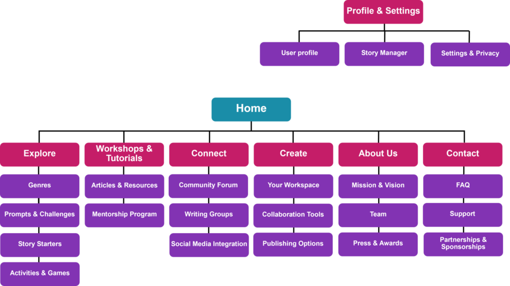
Imagine you’re planning a trip to a brand-new city you’ve never visited before. You’d probably want a map to help you find your way around, right? A sitemap is like that map, but for websites or apps. It’s a visual guide that shows you all the different sections and pages, how they’re connected, and where to find the specific things you’re looking for.
Some key benefits are:
- Clear navigation
- Improved search engine visibility
- Planning and collaboration
- User testing
This is the user map for the website I designed to create a user experience for teaching creative writing to teens:
Wireframes
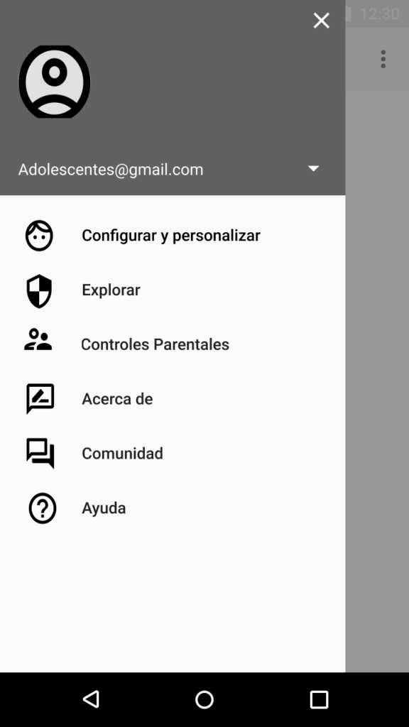
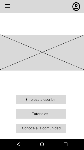
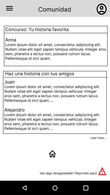
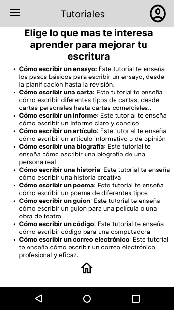
Wireframes are like a blueprint, but for digital things like websites or apps. They’re simple sketches that show the layout of the screen, where the buttons and menus go, and how everything flows together. They’re not pretty and colorful, just like your house blueprint wouldn’t have wallpaper patterns; it’s all about the structure and function.
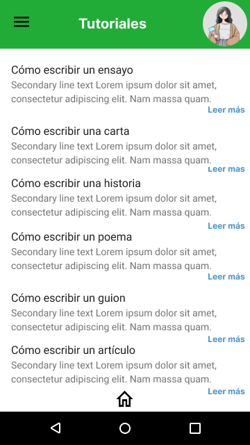
Here are the main wireframes for the teen-focused website I designed:
Mockups
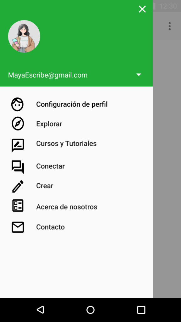
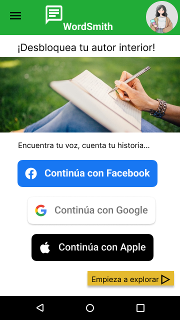
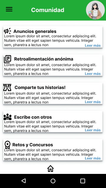
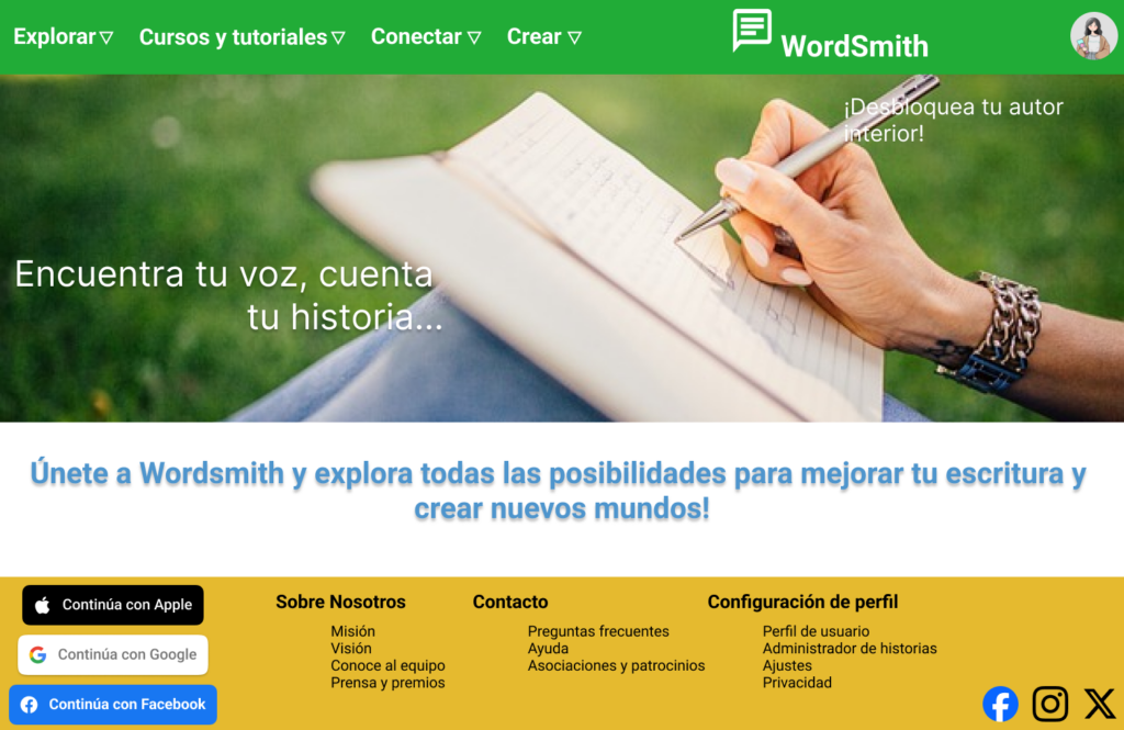
Mockups are like the decorated and furnished version of your house blueprint. They take the basic layout and functionality of UX wireframes and add the visual details that bring the design to life. Imagine your house plan now has walls painted in different colors, furniture placed in each room, and maybe even pictures on the walls.
Flow
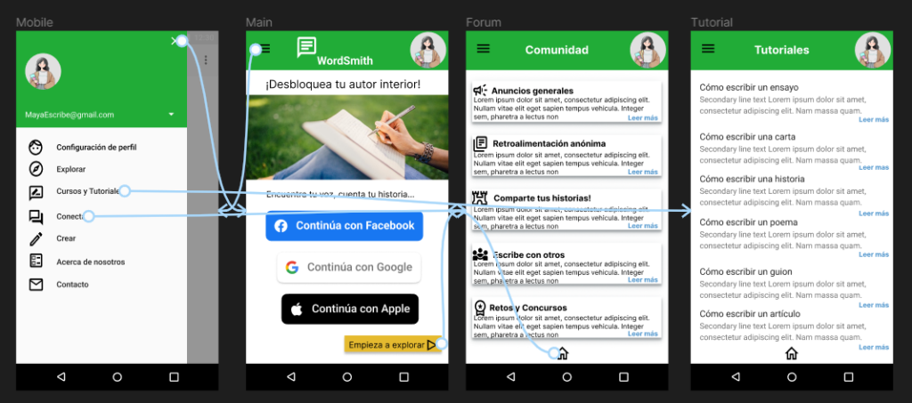
Mockups can also have a flow created in them, so we can add a visual representation to show stakeholders how everything might move around. The flow in this mockup, created in Figma, looks like this:
In short, UX mockups are the polished presentation of your digital product, showcasing its beauty, usability, and potential. They’re the bridge between the basic blueprint and the final masterpiece.
Responsive Design
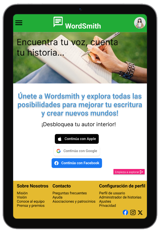
The designs for screen size variation included mobile, tablet and desktop. I optimized the designs to fit specific user needs of each device and screen size. I intended to optimize each screen size variation, having each version cater to the needs of users on each device. This tailored approach ensures a seamless and enjoyable experience regardless of how users encounter the design.
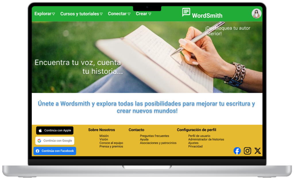
This project stands out as one of the most resource-intensive endeavors I’ve tackled, crafting this website proved to be a baptism by fire. Yet, it provided invaluable experience in developing a comprehensive approach to fully responsive website design, a skill set I’m proud to have honed.
Go back to the UX/UI Design – Cross-Platform Experience page
