Ideate
Para la versión en español, de click aquí.
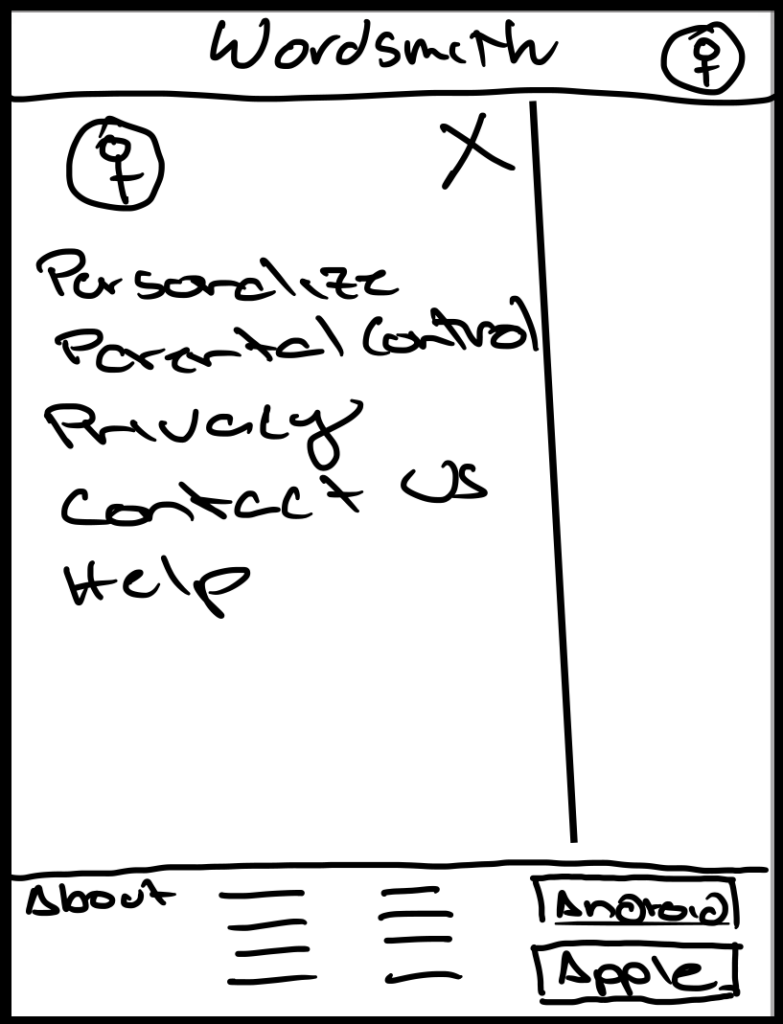
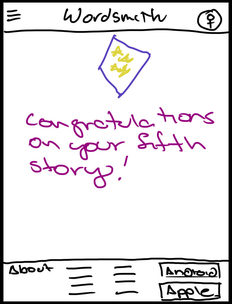
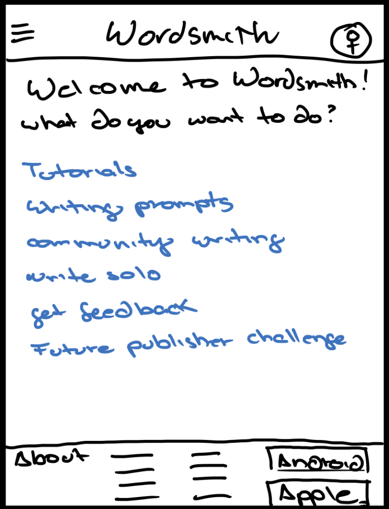
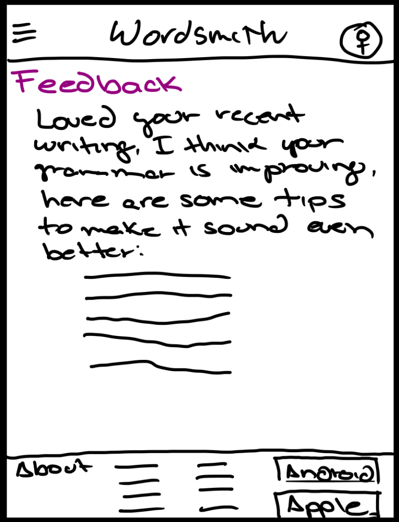
I embarked on a brainstorming session, unleashing a torrent of potential solutions. From timed writing sprints to gamified challenges punctuated by points and streaks, I explored a vibrant spectrum of ideas, each meticulously crafted with the user’s needs as my guiding star.
This will include:
- Crazy 8s example
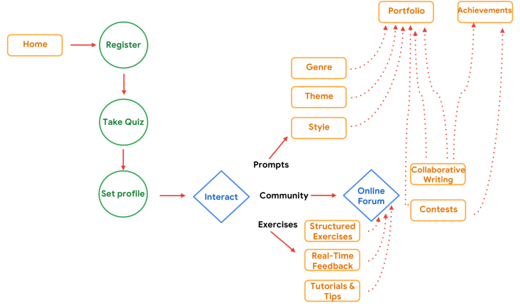
- User Flow
- Big-picture Storyboard
- User Interaction Storyboard
Crazy 8s
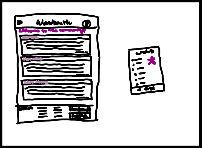
Crazy 8’s is a Design Sprint method that encourages rapid idea generation. Participants sketch eight distinct ideas in eight minutes, overcoming the limitations of their first idea to explore a wide range of solutions. This exercise fosters creativity and breaks down barriers, leading to innovative solutions. Here is one example of what I did:
User Flow
A visual representation of a user’s journey through a website or application, maps out each step and interaction, ensuring a smooth and intuitive experience. By understanding the user’s path, we can identify potential roadblocks, optimize conversion rates, personalize interactions, and uncover hidden opportunities to enhance the overall user experience.
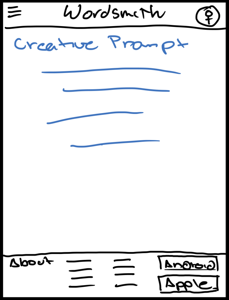
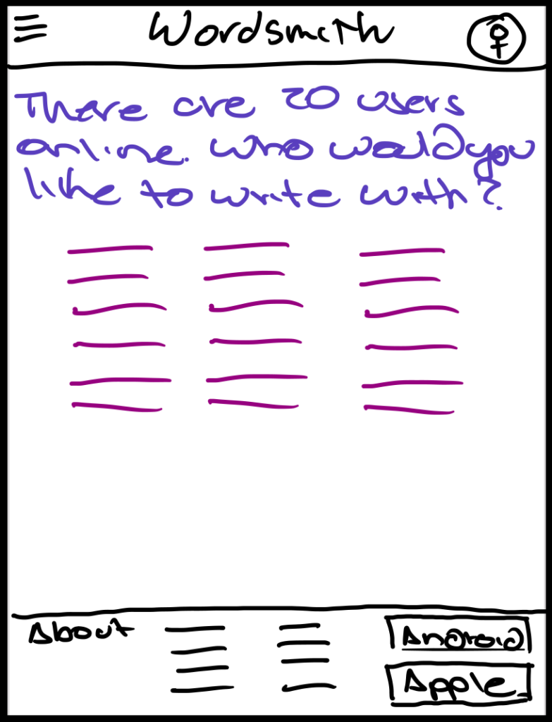
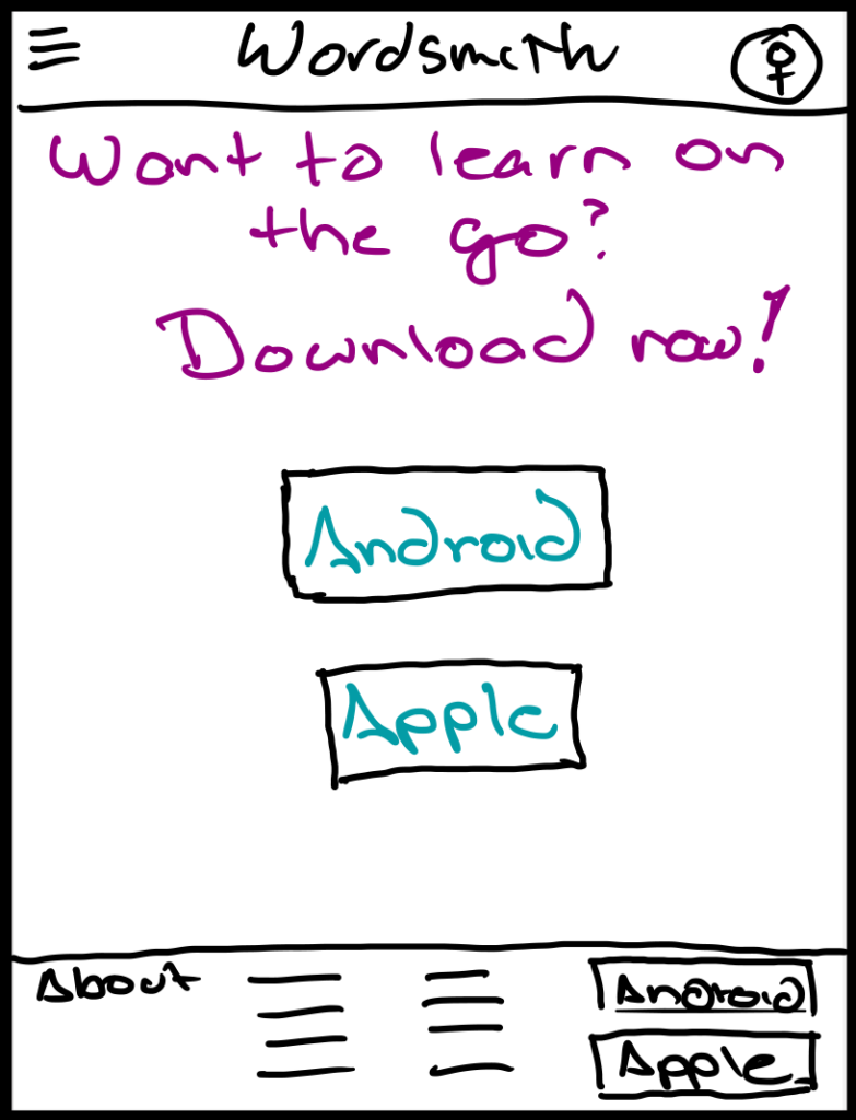
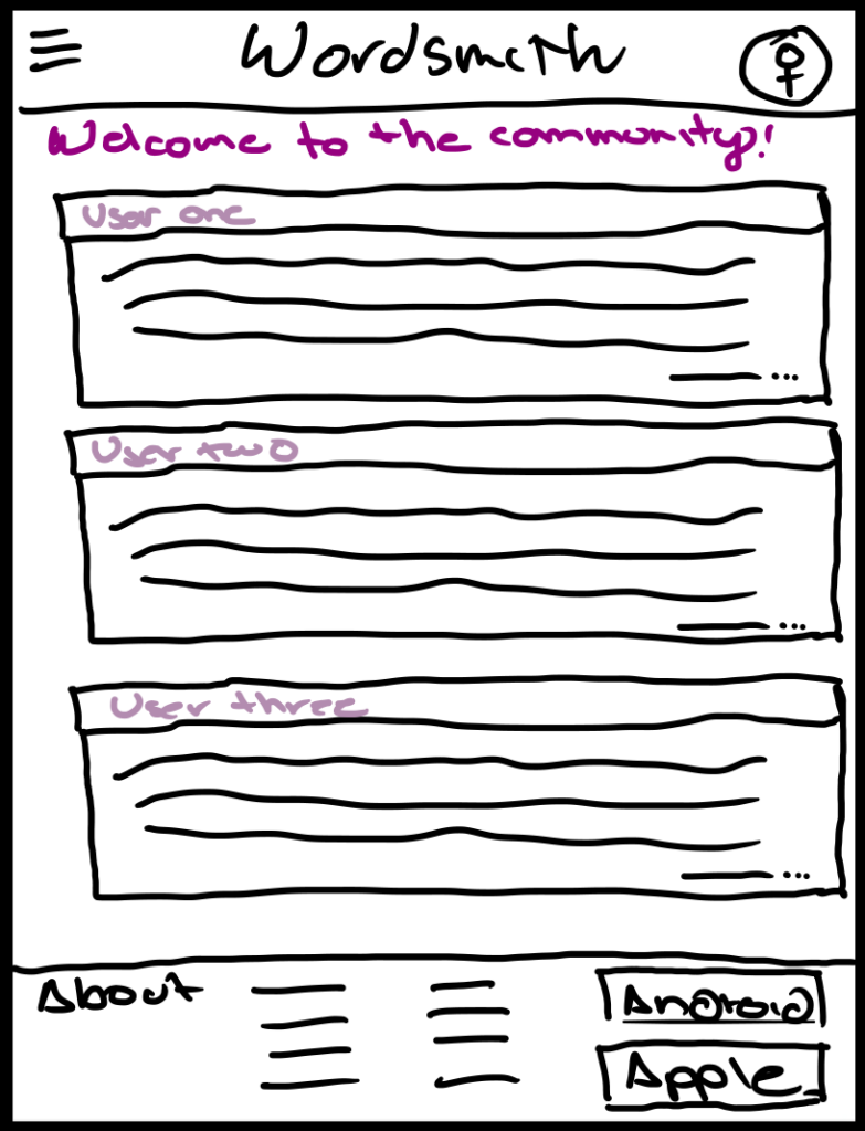
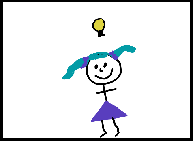
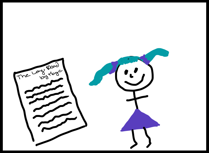
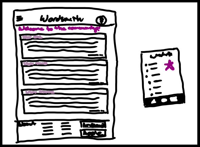
Big-Picture Storyboard
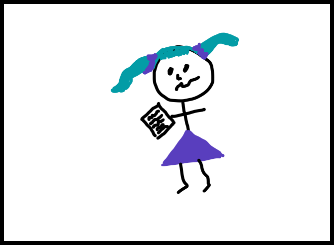
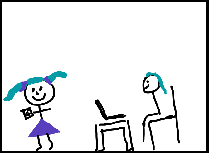
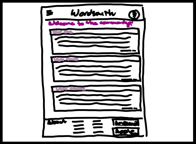
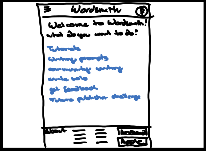
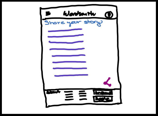
Big picture storyboards are like a movie trailer for your website or app. They show the user’s entire experience from start to finish, making sure it’s easy and enjoyable. Just like a good movie trailer, big-picture storyboards can make people excited to use your product.
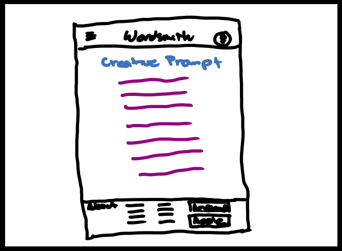
Feature-Specific Storyboard
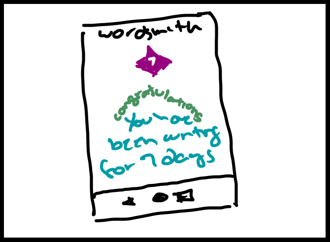
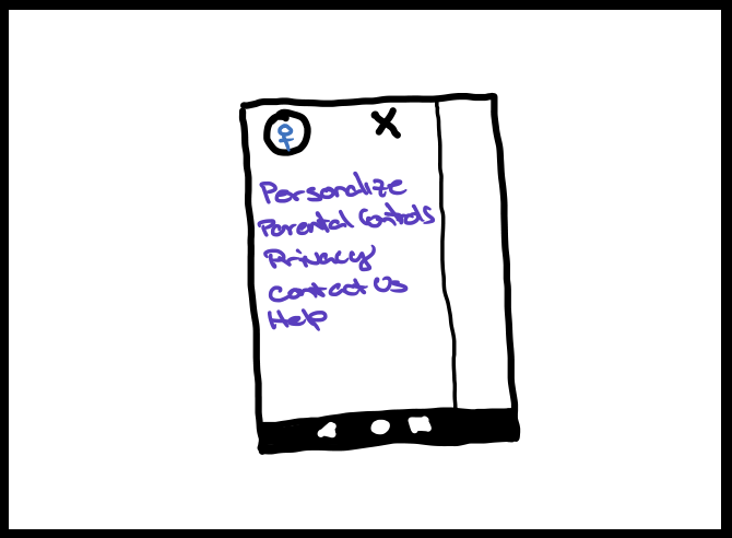
Feature-specific storyboards are like a close-up view of a particular part of a user’s experience. Instead of showing the whole journey, they zoom in on a specific feature or interaction to understand how the user will use it. This helps designers focus on the details and make sure the feature is easy to use and understand.
Go back to the UX/UI Design – Cross-Platform Experience page
