Test
Para la versión en español, de click aquí.
To validate the effectiveness of my designs, I conducted unmoderated user testing sessions, observing how fans interacted with the prototypes. I gathered valuable feedback on usability, intuitiveness, and overall satisfaction, enabling me to refine my designs further.
Through this iterative design thinking process, I successfully developed an album pre-order app that seamlessly integrated the needs of The Dollyrot’s fans with their unique artistic vision, solidifying my commitment to user-centered design principles.
In this section you will find:
- Empathy Map
- Usability Study
- Affinity Diagram
Empathy Map
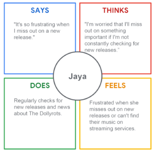
An Empathy Map is a tool to understand someone else’s point of view, their feelings, needs, and challenges. It’s not about you, it’s about stepping into their shoes and seeing the world through their eyes. For this section, I created an Empathy Map based on Jaya Frankie’s persona, which we found in the empathize section earlier.
Usability Study
Following recruitment of five participants, the unmoderated usability study proceeded. Each participant completed the design-related questions at their own convenience, providing valuable real-world feedback. Conducting such studies allows us to gain user insights and ensure we’re creating something people will genuinely enjoy using.
With feedback from the participants, we were able to create the following graph:
| Participant A | Participant B | Participant C | Participant D | Participant E | |
|---|---|---|---|---|---|
| It was easy for them to complete the task | 1 | 1 | 1 | ||
| Finds it difficult to complete the task | 1 | 1 | |||
| Knows how to start | 1 | 1 | 1 | 1 | 1 |
| Chooses the option to personalize without confusion | 1 | 1 | |||
| Chooses a type of personalization | 1 | 1 | 1 | ||
| Feels frustrated with so many options | 1 | ||||
| Has trouble selecting other merchandise | 1 | 1 | |||
| Has trouble finding where to edit the profile | 1 | 1 | 1 | ||
| Finds it difficult to complete the payment process | 1 | ||||
| Speak in a positive tone | 1 | 1 | 1 | ||
| Speaks in an indifferent tone | 1 | ||||
| Speaks in a frustrated tone | 1 | ||||
| Speaks in an annoyed or impatient tone | |||||
| Speak in a confident tone | 1 | 1 | 1 | 1 | |
| Observations | Wants to support The Dollyrots for being independent | “I don’t need to buy more things!” | “I don’t understand why I need to order it in advance” | Wants to add desired shipping date | Finds the idea of an application is interesting |
| Observations | Will pay the pre-sale and purchase extra merchandise | Wants technical support | Is there some way to enlarge the font size? | Would like more payment methods | Really wants the new album |
Affinity Diagram
UX Affinity Diagrams sort through the data collected in studies and find connections between seemingly random items. It’s a great way to organize thoughts, identify key issues, and make sure the design is something that people actually want and need. The affinity diagram was created after doing an unmoderated usability test with five people. Each color represents one of the people that were tested.
These are, by no means, all the studies done, the competitive report and the usability report, among others are missing from this project, available upon request.

