Prototype
Para la versión en español, de click aquí.
With a few promising ideas in hand, I transitioned into the prototyping phase, transforming my concepts into tangible representations. I crafted low-fidelity prototypes using paper and sketches, allowing for rapid iterations and feedback from fellow designers who were also working on this course and potential users. I also learned how to use Figma to create low-fidelity prototypes and mockups.
This will include:
- Wireframes
- Mockups
- Flow
Wireframes
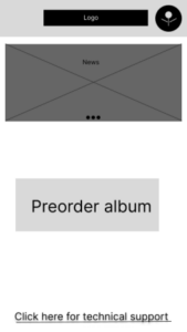
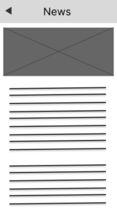
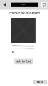
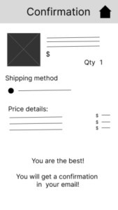
Wireframes are like a blueprint, but for digital things like websites or apps. They’re simple sketches that show the layout of the screen, where the buttons and menus go, and how everything flows together. They’re not pretty and colorful, just like your house blueprint wouldn’t have wallpaper patterns; it’s all about the structure and function.
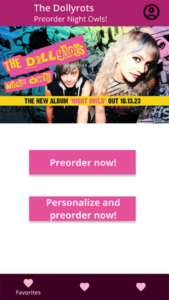
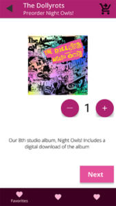
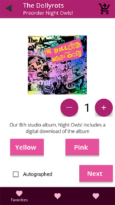
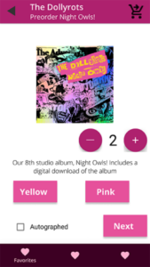
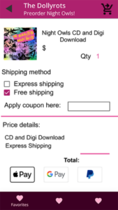
Here are the main wireframes for the preordering app that I designed:
Mockups
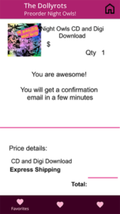
Mockups are like the decorated and furnished version of your house blueprint. They take the basic layout and functionality of UX wireframes and add the visual details that bring the design to life. Imagine your house plan now has walls painted in different colors, furniture placed in each room, and maybe even pictures on the walls.
Flow
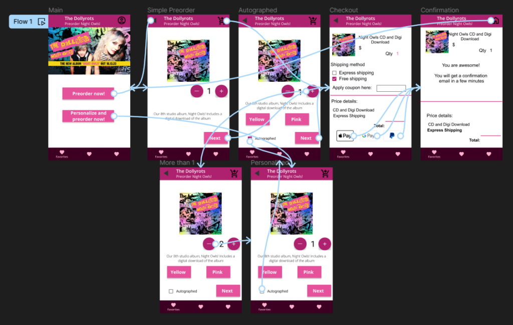
Mockups can also have a flow created in them, so we can add a visual representation to show stakeholders how everything might look like. The flow in this mockup, created in Figma, looks like this:
In short, UX mockups are the polished presentation of your digital product, showcasing its beauty, usability, and potential. They’re the bridge between the basic blueprint and the final masterpiece.
