Test
Para la versión en español, de click aquí.
To validate the effectiveness of my designs, I conducted unmoderated user testing sessions, observing how fans interacted with the prototypes. I gathered valuable feedback on usability, intuitiveness, and overall satisfaction, enabling me to refine my designs further.
Through this iterative design thinking process, I successfully designed a flow to take a quiz for an online tutoring service, solidifying my commitment to user-centered design principles.
In this section you will find:
- Empathy Map
- Usability Study
- Affinity Diagram
Empathy Map
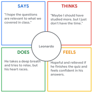
An Empathy Map is a tool to understand someone else’s point of view, their feelings, needs, and challenges. It’s not about you, it’s about stepping into their shoes and seeing the world through their eyes. For this section, I created an Empathy Map based on Leonardo’s persona, which we found in the empathize section.
Usability Study
Following recruitment of five participants, the unmoderated usability study proceeded. Each participant completed the design-related questions at their own convenience, providing valuable real-world feedback. Conducting such studies allows us to gain user insights and ensure we’re creating something people will genuinely enjoy using.
With feedback from the participants, we were able to create the following graph:
| Participant A | Participant B | Participant C | Participant D | Participant E | |
|---|---|---|---|---|---|
| The quiz accurately assess the user’s current skill level and learning gaps. | 1 | 1 | 1 | 1 | |
| The questions is focused on the specific subject or topic the user is seeking help with. | 1 | 1 | 1 | 1 | |
| Is it the right balance of easy and complicated tests? | 1 | 1 | 1 | ||
| The user finds the timed quizzes valuable | 1 | 1 | |||
| The instructions and scoring metrics are clear and help the user understand what areas need improvement. | 1 | 1 | 1 | ||
| The user finds the tracking of progress and effort valuble | 1 | 1 | 1 | 1 | |
| Has trouble finding where to edit the profile | 1 | 1 | |||
| The user finds the page easy to navigate | 1 | 1 | 1 | 1 | 1 |
| The user finds it easy to register and login | 1 | 1 | 1 | 1 | 1 |
| The user finds the quizzes and tutor help valuable | 1 | 1 | 1 | ||
| The user found technical issues | 1 | ||||
| Observations | “I would love to see a mix of question formats (multiple choice, fill-in-the-blank, short answer) to keep things engaging.” | “If it’s too easy I feel like it’s a waste of time, too hard and I get discouraged” | Mentions they need something for them to create a study habit | “Maybe you could adjust difficulty based on individual learning style preferences.” | “I hope that the quiz data helps in matching students with tutors who best suit their learning style, personality, and preferred communication methods. |
| Observations | “Clear instructions and scoring metrics help me understand how I’m doing and what areas need improvement.” | “I feel that I need to have my strengths and weaknesses balanced with concrete suggestions for improvement. | “Encouraging messages, animations, or virtual rewards to maintain motivation should be added.” | Mentions that introducing surprise elements like bonus questions or interactive challenges could keep students engaged. |
Affinity Diagram
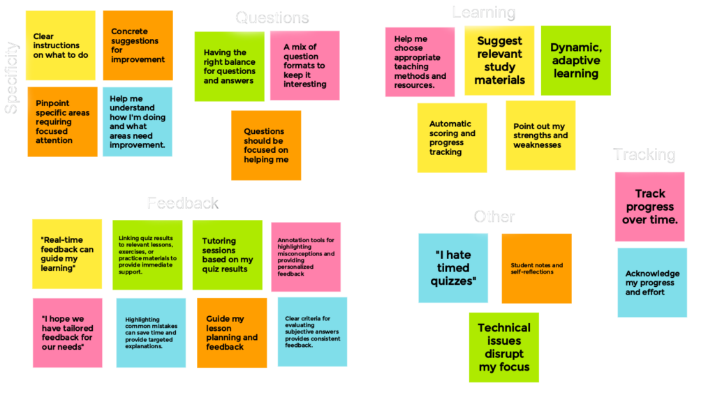
UX Affinity Diagrams sort through the data collected in studies and find connections between seemingly random items. It’s a great way to organize thoughts, identify key issues, and make sure the design is something that people actually want and need. The affinity diagram was created after doing an unmoderated usability test with five people. Each color represents one of the people that were tested.
These are, by no means, all the studies done, the competitive report and the usability report, among others are missing from this project, available upon request.

