Ideate
Para la versión en español, de click aquí.
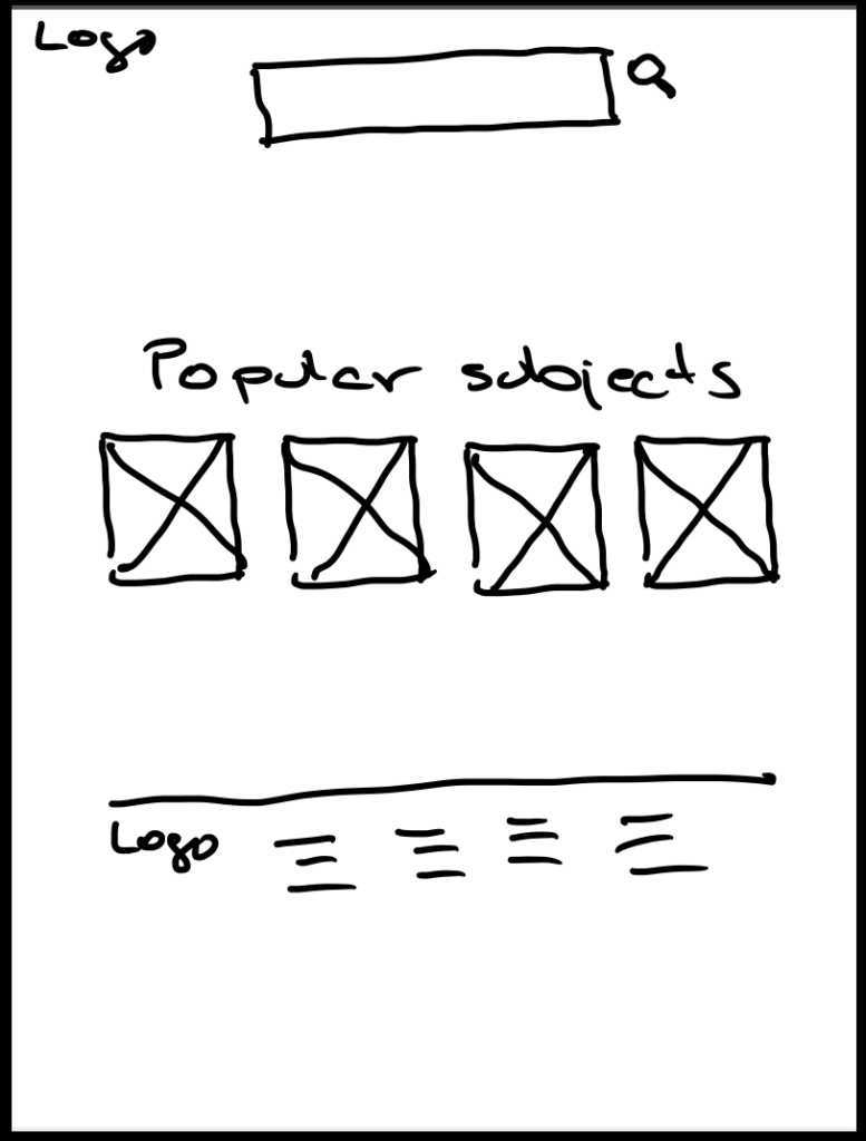
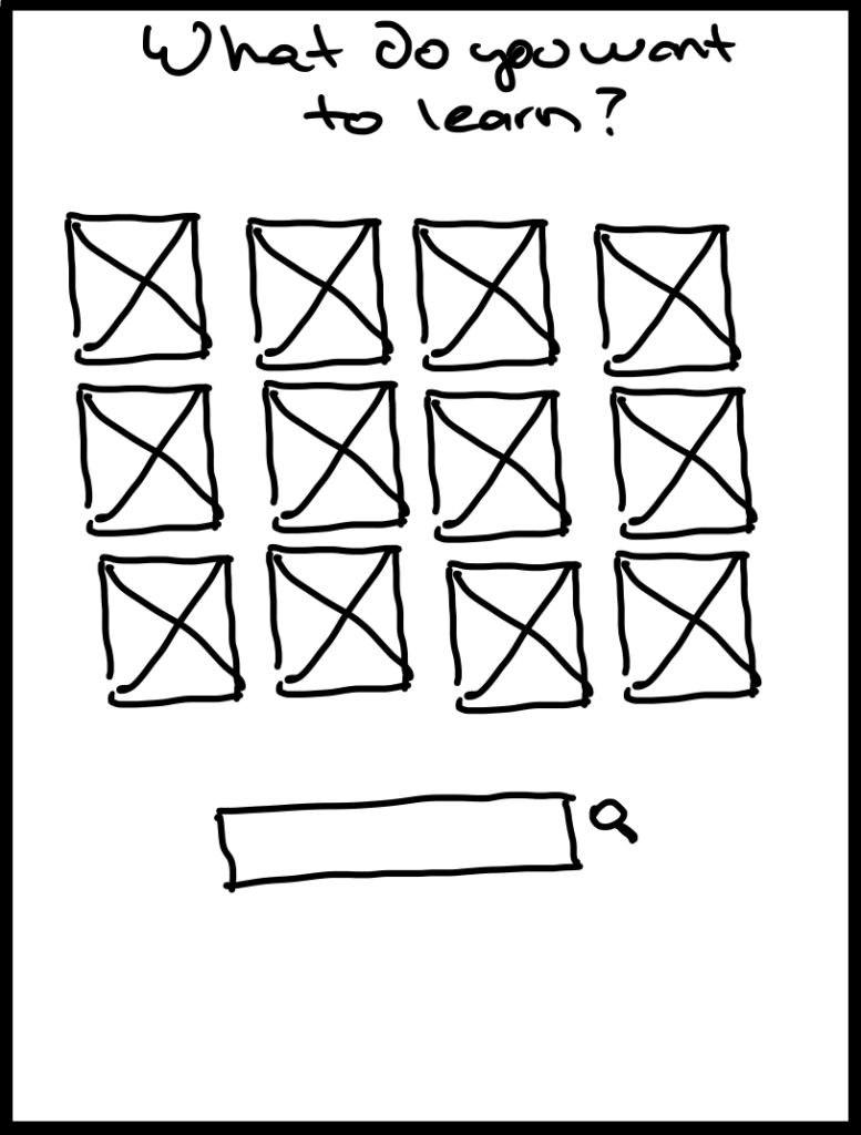
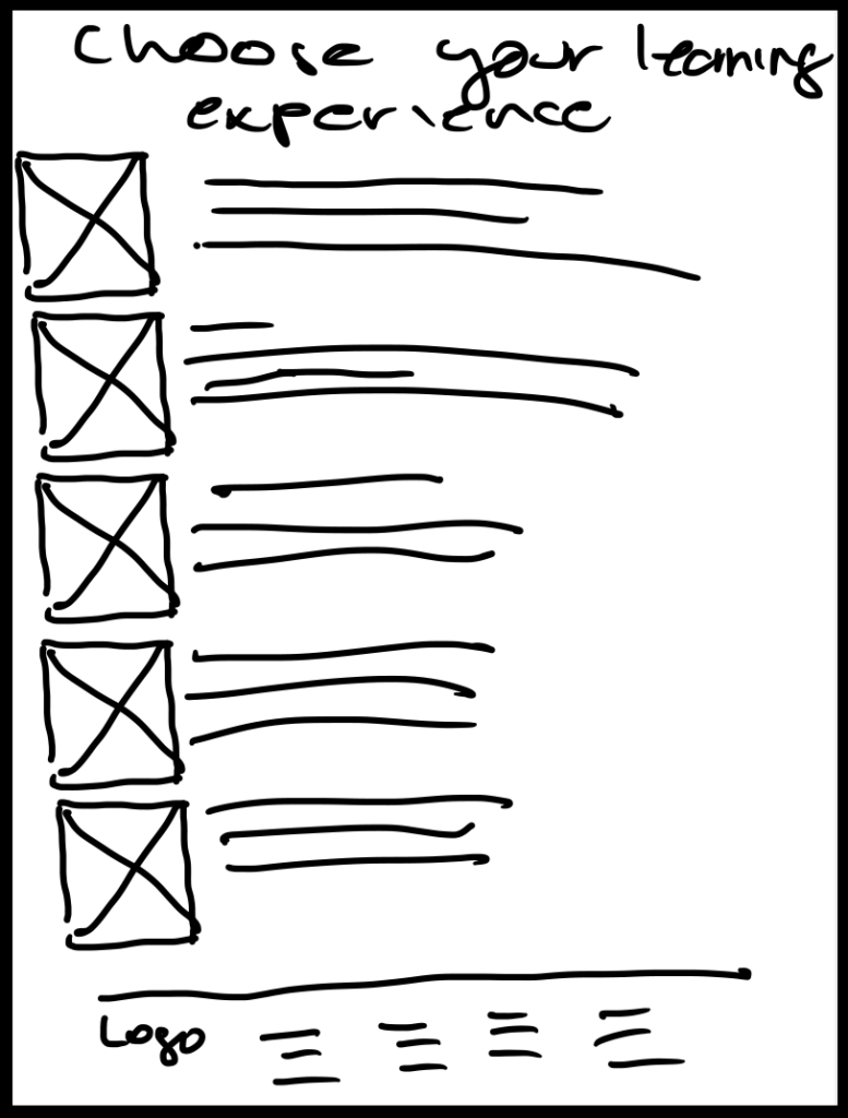
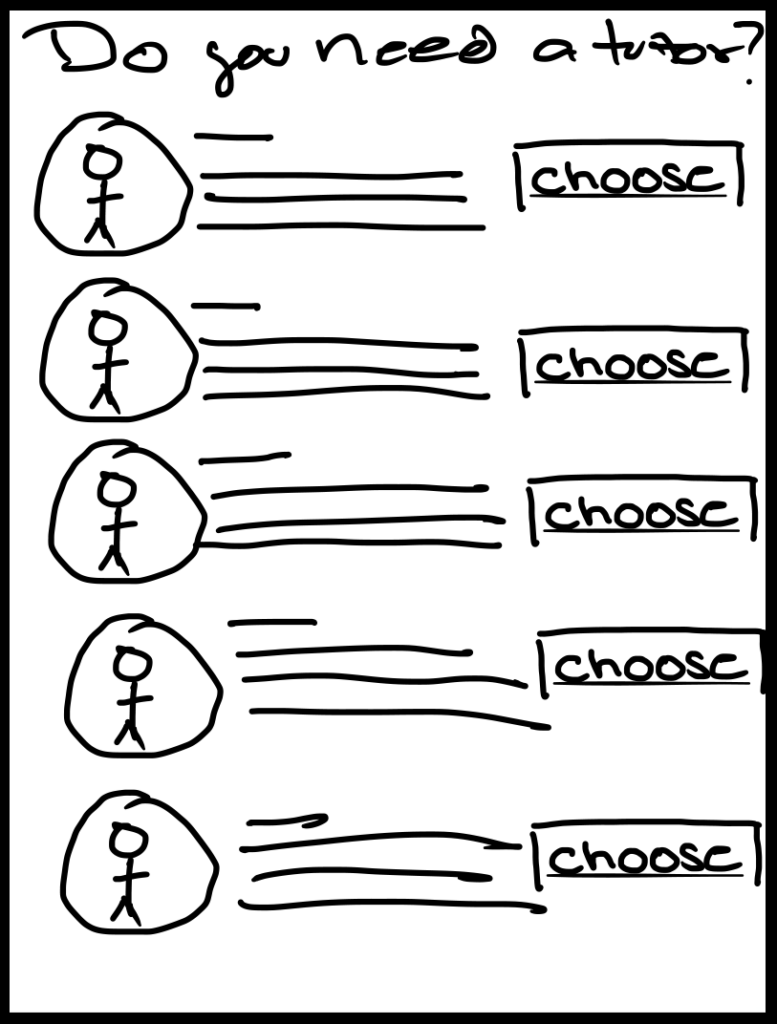
With creativity, I worked on a brainstorming session, generating several potential solutions. I explored ideas ranging from interactive album previews to gamified pre-order incentives, all while keeping the user’s needs at the forefront.
- Crazy 8s example
- User Flow
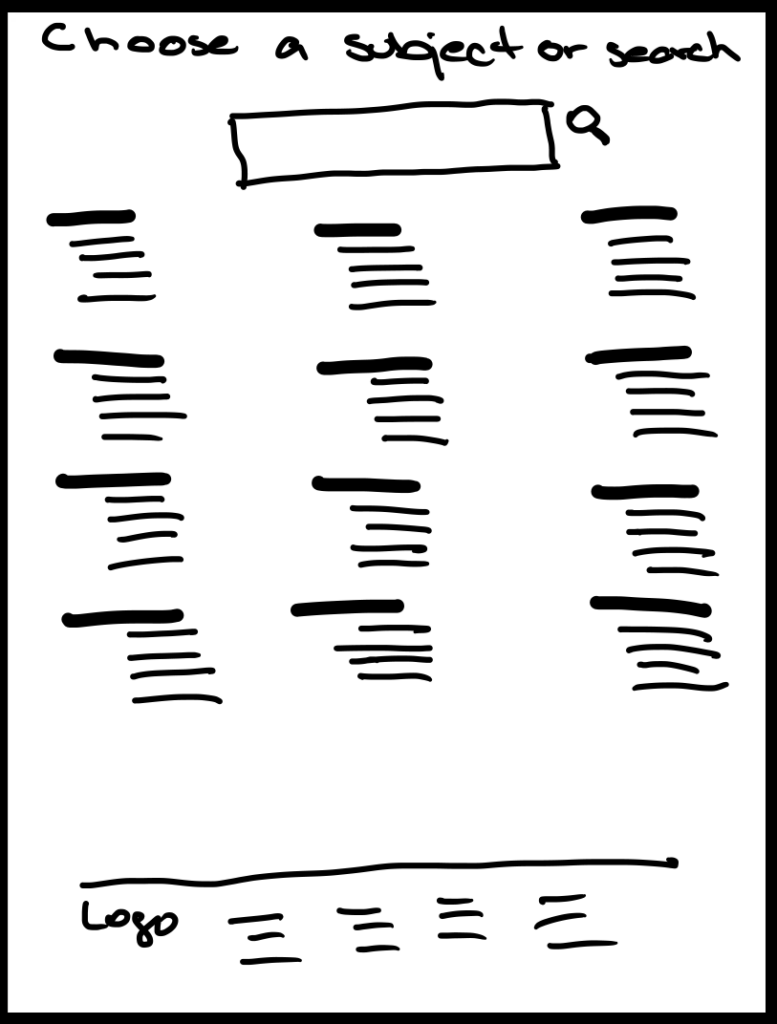
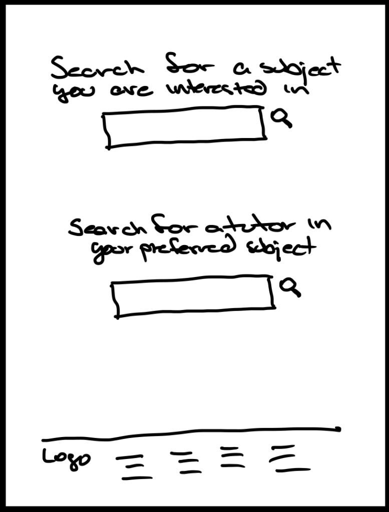
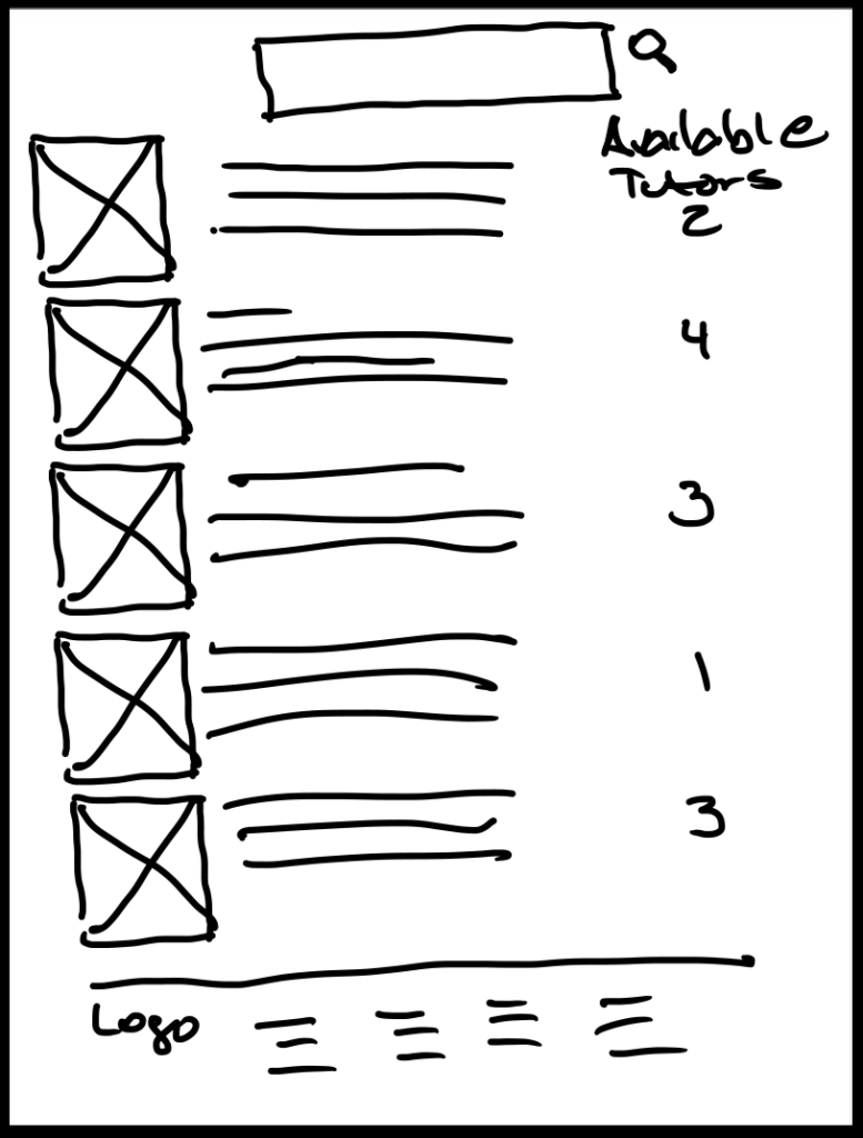
- Big-picture Storyboard
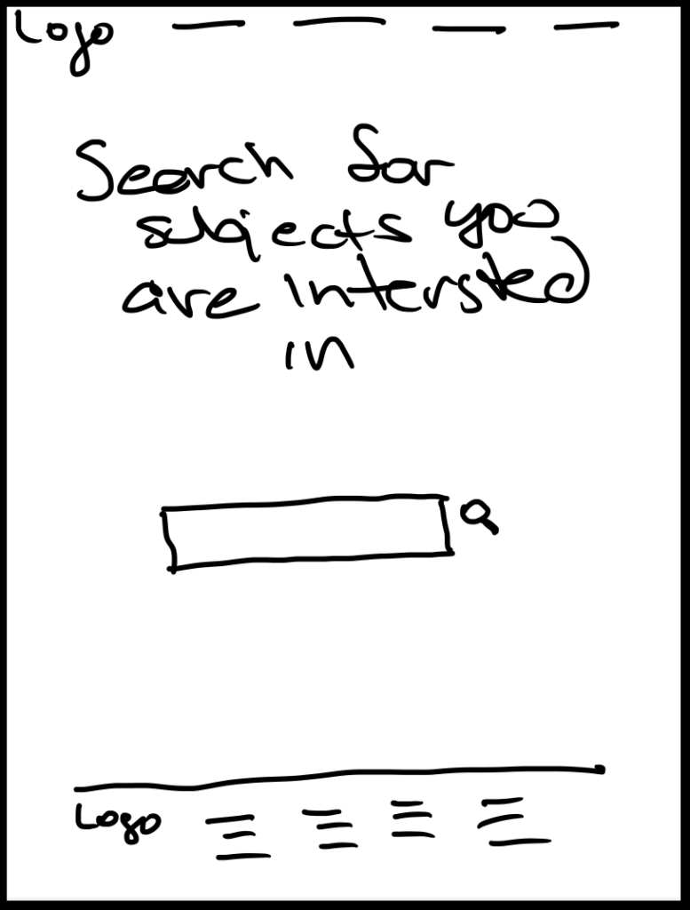
- User Interaction Storyboard
Crazy 8s
Crazy 8’s is a Design Sprint method that encourages rapid idea generation. Participants sketch eight distinct ideas in eight minutes, overcoming the limitations of their first idea to explore a wide range of solutions. This exercise fosters creativity and breaks down barriers, leading to innovative solutions. Here is one example of what I did:
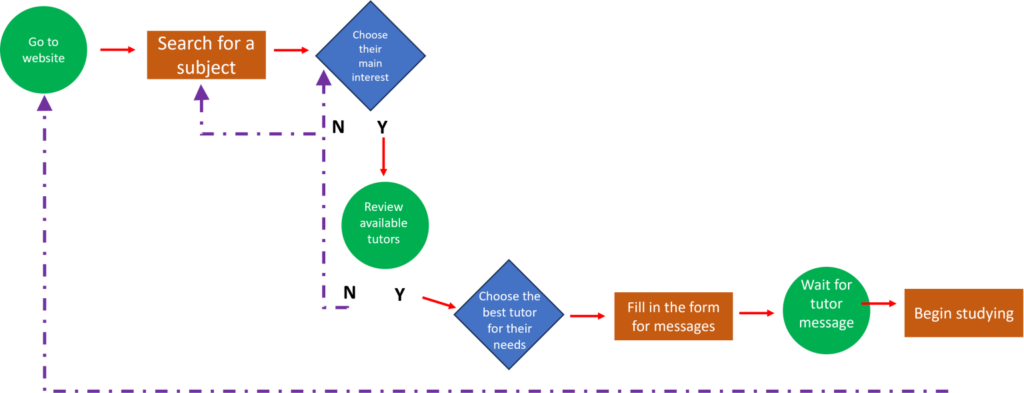
User Flow
A visual representation of a user’s journey through a website or application, maps out each step and interaction, ensuring a smooth and intuitive experience. By understanding the user’s path, we can identify potential roadblocks, optimize conversion rates, personalize interactions, and uncover hidden opportunities to enhance the overall user experience.
Big-Picture Storyboard
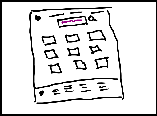
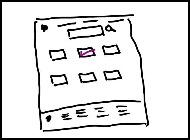
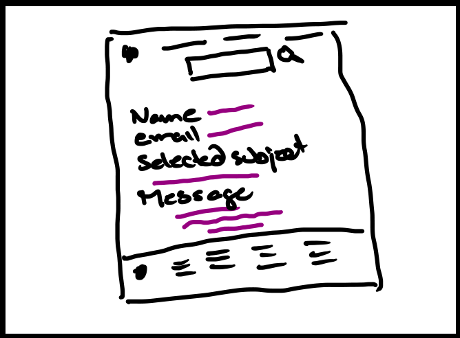
Big picture storyboards are like a movie trailer for your website or app. They show the user’s entire experience from start to finish, making sure it’s easy and enjoyable. Just like a good movie trailer, big-picture storyboards can make people excited to use your product.
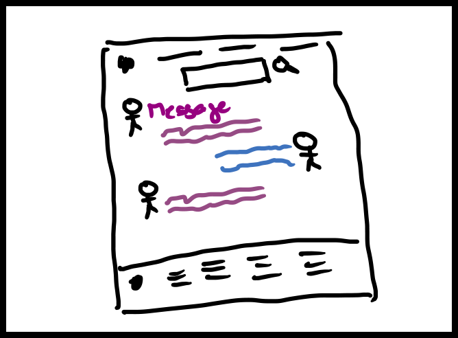
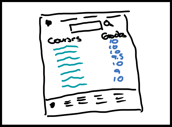
Feature-Specific Storyboard
Feature-specific storyboards are like a close-up view of a particular part of a user’s experience. Instead of showing the whole journey, they zoom in on a specific feature or interaction to understand how the user will use it. This helps designers focus on the details and make sure the feature is easy to use and understand.
