Email Marketing
Para la versión en español, de click aquí.
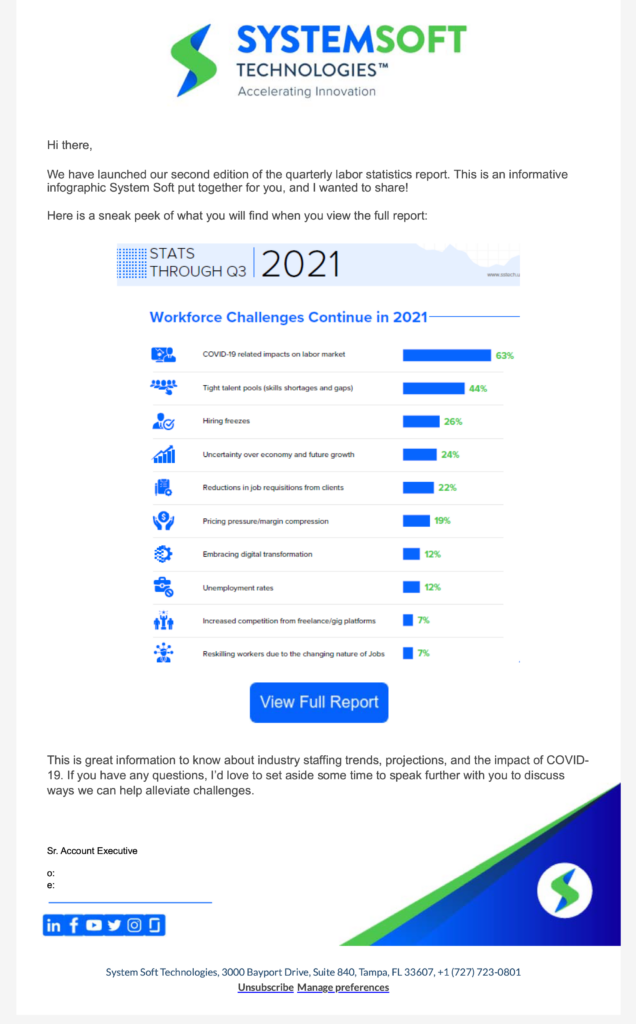
A big part of my marketing experience has been in Email Marketing Campaigns. Having experience in MyEmma, Hubspot, Marketo, Dynamics365, Klavyio, and Eloqua, I want to discuss some examples of campaigns I have done.
I enjoy working on email marketing campaigns. I find it satisfying to be the go-to person for these campaigns and to be responsible for creating engaging and effective email programs. I also enjoy analyzing the performance of these campaigns, making corrections when necessary, and sharing my findings with my team.
I get a sense of accomplishment from seeing the results of my work. When I see that an email campaign has been successful, I know that I have made a positive impact on our clients and the company. I also enjoy the challenge of coming up with new and creative ways to reach our customers and prospects.
Simple Campaign
This campaign consisted of a single email sent to clients; however, it was sent from 13 different email addresses to 159 clients, so that each salesperson would have the opportunity to interact directly with clients in their region, as the lists were segmented per region. The objective was for the salesperson to interact directly with those clients, engaging and converting them.
This was a team effort. I worked with our copywriter and the design team to create engaging content received from one of the associations we subscribe to, that was freely distributed. I was responsible for creating the email copy in HubSpot, uploading and segmenting the contact list, and creating the email automation journey.
The success of this campaign was evident in the increased engagement of our clients with our salespeople. We saw a significant increase in the number of client meetings, as well as the length and quality of those meetings. This led to the creation of tighter ties between our salespeople and our clients, which in turn resulted in better relationships with our customers.
A/B Testing
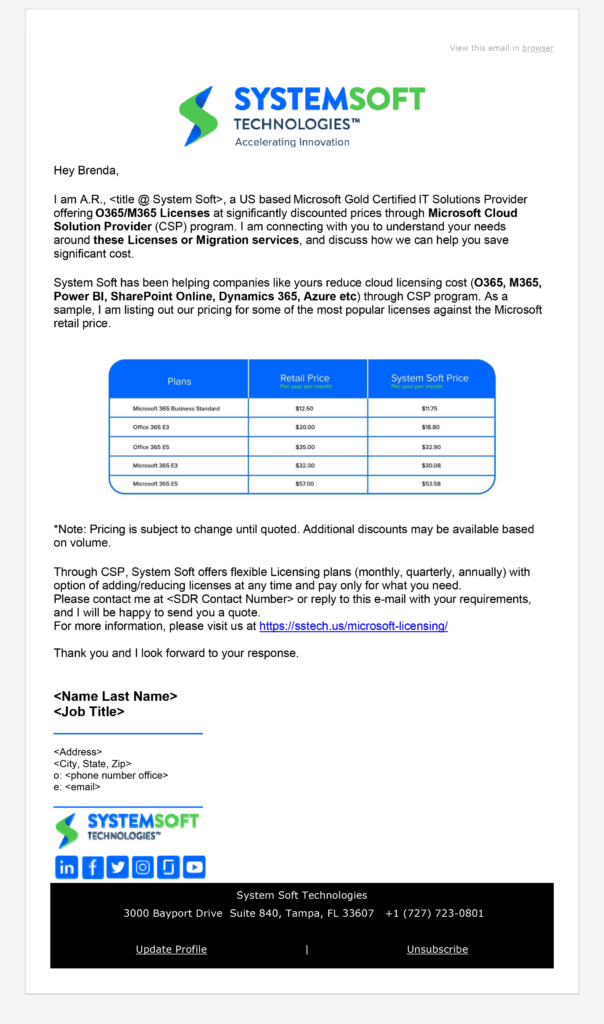
This email was sent by six different salespeople. However, each one of them had a different subject line, allowing us to do some A/B testing. For privacy reasons, I am only using the salespeople’s initials to show the different subject lines we used for this campaign:
D.M. – Are You Paying Too Much for Microsoft Licensing?
A.R. – Let’s Stop Overspending on Microsoft Licensing.
M.K. – Microsoft Gold Partner = Saving You Gold.
N.H. – Ready to Save on Your Microsoft Licensing?
M.R. – Rethink Your Microsoft Licensing Strategy and Save $
B.B. – Save Money by Updating Your Microsoft Licensing Strategy
We conducted an A/B test of six different subject lines to determine which one would be most effective in generating opens and clicks. The subject line that had the highest open rate and click-through rate was “Save Money by Updating Your Microsoft Licensing Strategy,” which was sent by B.B.
We believe that the high open rate and click-through rate for this subject line were due to a number of factors, including:
- The subject line was clear and concise, and it accurately reflected the content of the email.
- The subject line used the word “save,” which is a powerful motivator.
- The subject line created a sense of urgency by mentioning that the recipient could save money by updating their Microsoft licensing strategy.
You can review the complete stats here:
| D.M. | Are You Paying Too Much for Microsoft Licensing? | 249 | 0.80% | 0.40% | 249 | 124 | 49.8% | 1.60% | 0.00% | 0 |
| A.R | Let’s Stop Overspending on Microsoft Licensing. | 245 | 0.80% | 0.40% | 246 | 125 | 51.0% | 0.82% | 0.00% | 0 |
| M.K. | Microsoft Gold Partner = Saving You Gold. | 194 | 0.00% | 0.00% | 194 | 128 | 66.0% | 1.55% | 0.00% | 0 |
| N.H | Ready to Save on Your Microsoft Licensing? | 258 | 0.70% | 0.40% | 258 | 144 | 55.80% | 1.16% | 0.00% | 0 |
| M.R. | Rethink to Save on Your Microsoft Licensing Strategy and Save $ | 189 | 0.80% | 0.50% | 189 | 125 | 66.10% | 2.12% | 0.00% | 0 |
| B.B | Save Money by Updating Your Microsoft Licensing Strategy | 254 | 1.40% | 0.80% | 252 | 143 | 56.70% | 1.59% | 0.79% | 0 |
Webinar / LinkedIn Live Email Segmentation
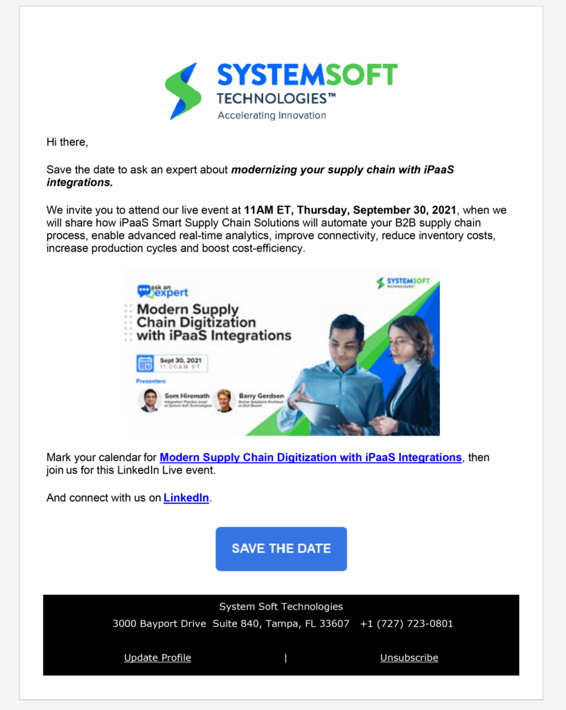
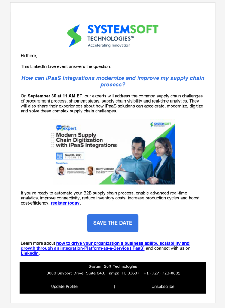
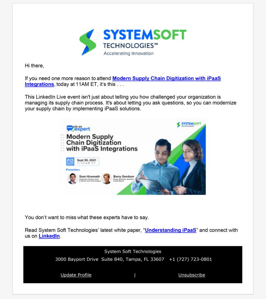
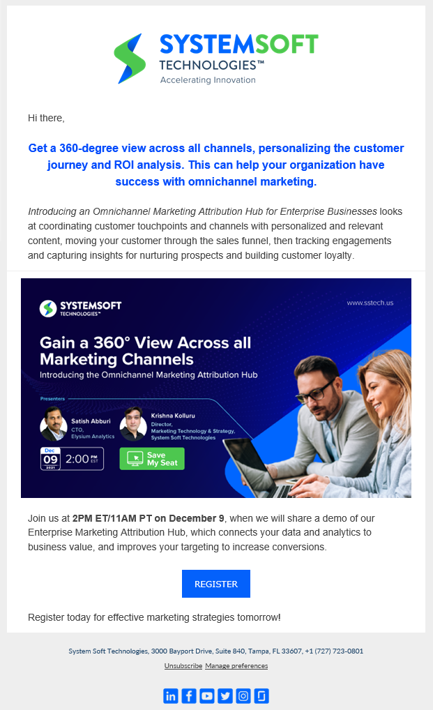
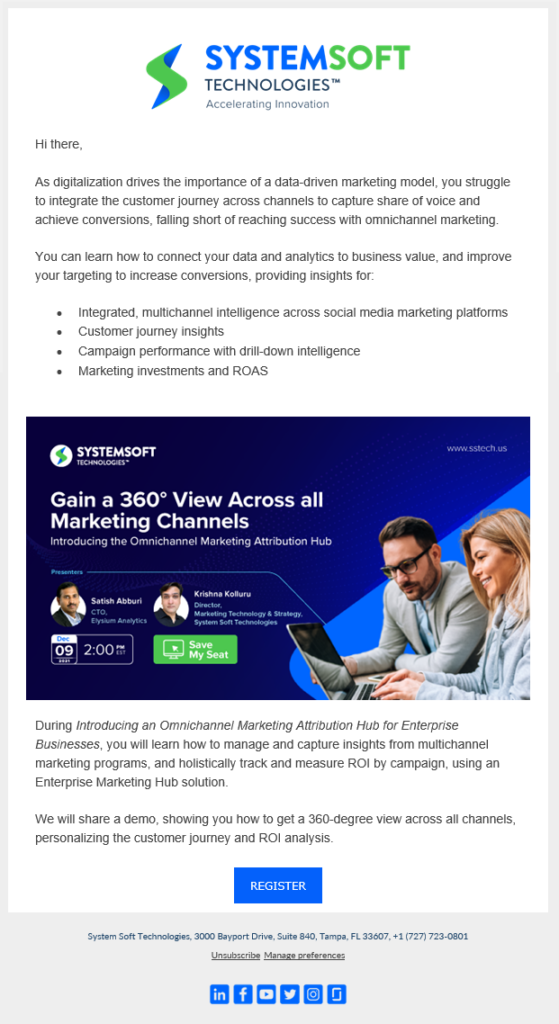
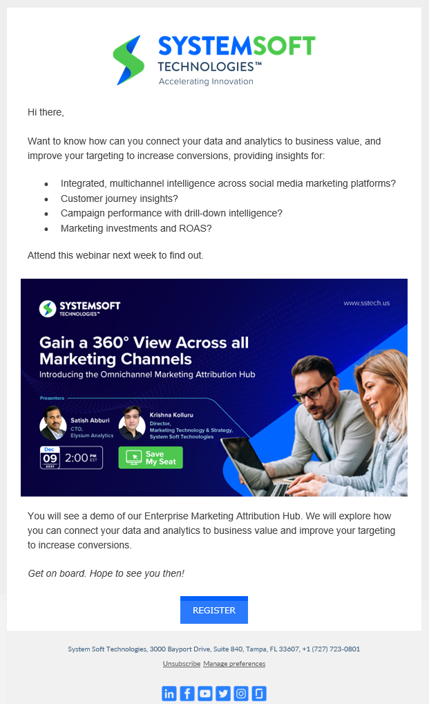
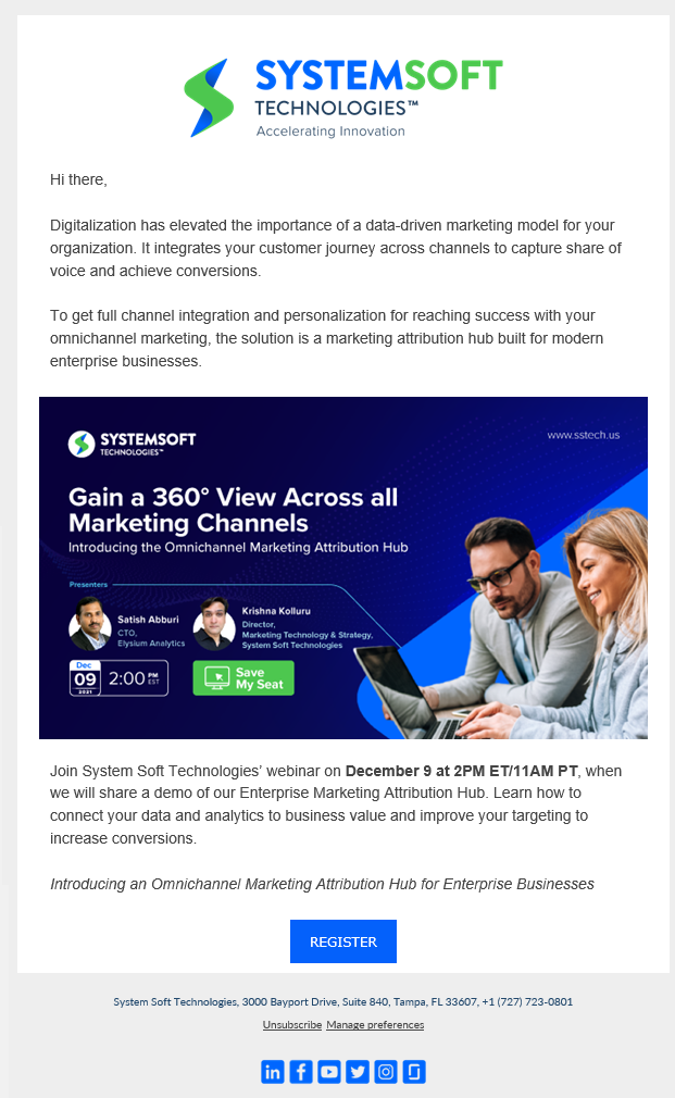
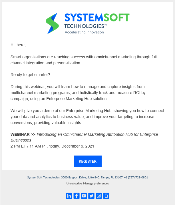
The email sequence for the Cloud, Architecture, and Data Integration webinar targeted 2,666 people in the IT industry. The save-the-date email was sent ten days before the event, with a call to action (CTA) to create a calendar event. The invite email was sent the following week, with a CTA to the registration landing page. Two days before the event, a reminder email was sent to keep the event top of mind for those who were interested, with a last opportunity to register.
For more information on segmentation and suppression lists, please see below:
Webinar Demographics
Segments used
- Digital Enterprise Architect
- Dir/VP Enterprise Apps
- Director Cloud Analytics
- Director Data Integration
- Director Integration + Architecture
- Director of IT Enterprise Integration
- IT Transformation Lead
- VP Cloud Engineering
- VP Director IT
- VP Enterprise Architecture
Supressed lists
- Do Not Email (Unsubscribed)
- Hard Bounces
Webinar Invitation Schedule
The first email was sent on Thursday, November 18, 2021, at 10:18 am local time to the following targets:
- Brand Marketing Strategist
- Brand Management Director
- Chief Digital Officer
- Chief Marketing Officer
- Marketing Operations Director
- Marketing Director
- Marketing Manager
- Senior Marketing Strategist
- VP of Marketing
- VP of Product
Final results:
We received 111 registrations for the webinar, of which 87 people attended. We had received permission to contact 68 of the attendees.
A single follow-up email was sent to everyone who had registered for the webinar, whether they attended or not. The email included a link to the webinar recording and presentation with no sales intent.
The 68 attendees who had given us permission to contact them were segmented by location and relayed to the appropriate salespersons. This allowed our salespeople to reach out to the attendees who were most likely to be interested in our products or services.
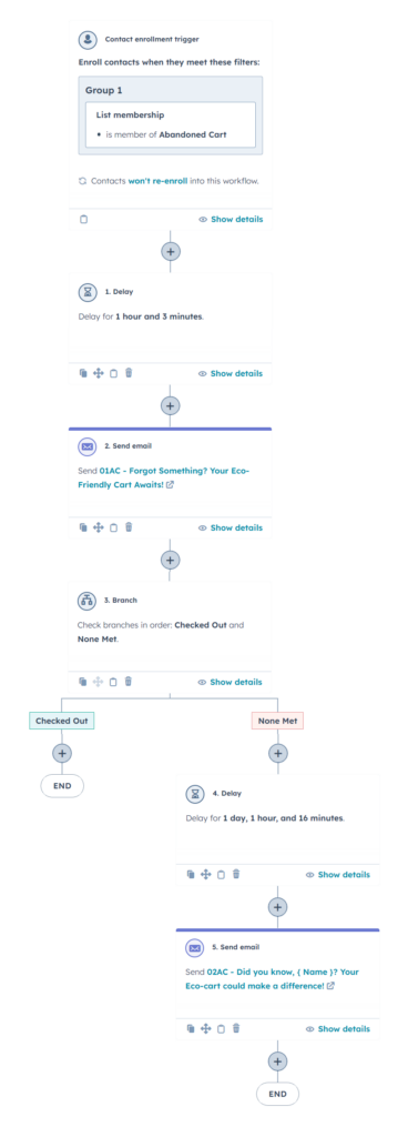
Abandoned Cart Sequence
Ever browsed online stores, filling your cart with treasures before changing your mind and leaving them behind? That’s shopping cart abandonment, a common challenge for businesses where potential customers add items but never complete the purchase. Understanding why they “ditch their carts” helps businesses improve their checkout process and recapture lost sales. With a gentle nudge, some of those abandoned carts can still make it through, proving that a well-designed customer journey can work wonders.
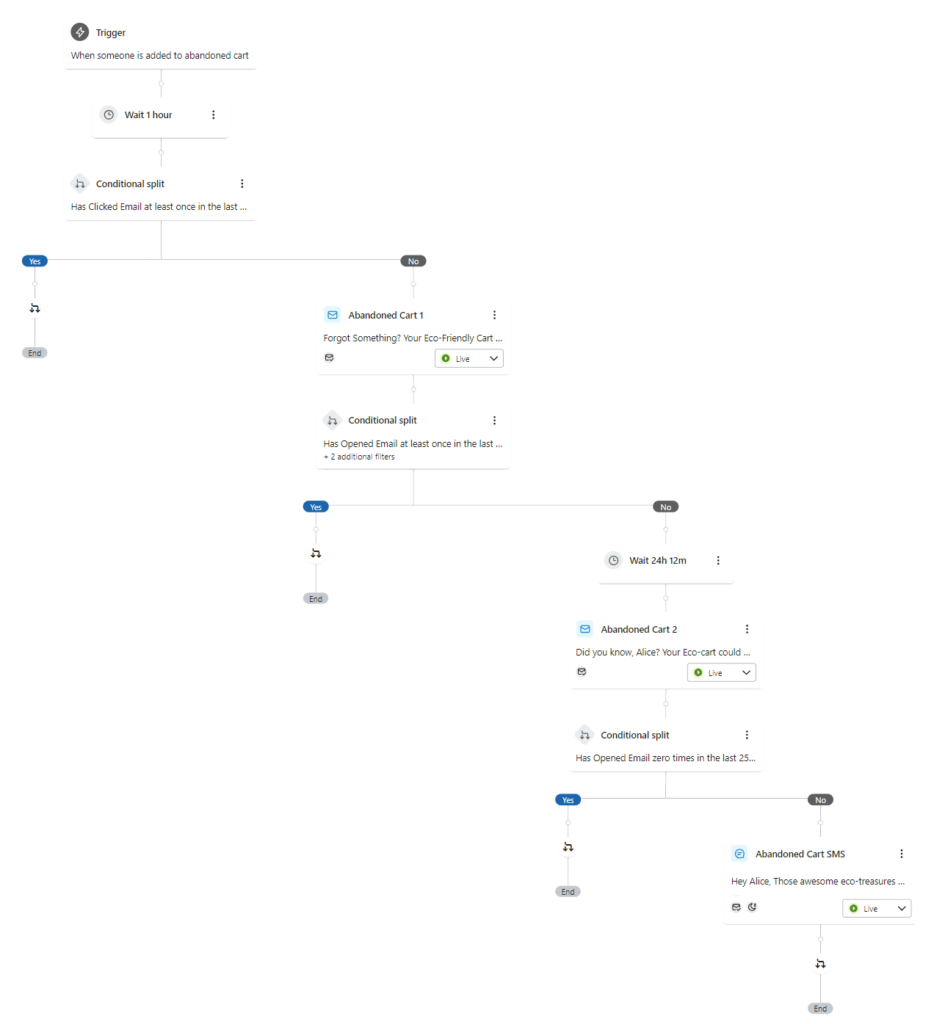
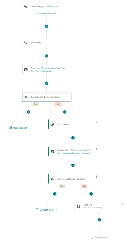
While I cannot share details about the specific company due to privacy reasons, I can provide a sample of the abandoned cart sequence I helped create for their environmentally friendly product.
Our goal is that those new and existing customers who added items to their cart, but didn’t complete the purchase, complete it with a few gentle reminders and possibly a small discount or free shipping.
Timeline
- Email 1: Sent 1 hour after cart abandonment.
- Email 2: Sent 24 hours after cart abandonment.
- SMS 1: Sent 48 hours after cart abandonment (optional).
Before launching an abandoned cart sequence, it’s crucial to remember the power of personalization. This makes customers feel valued and increases engagement. Additionally, consider segmenting your audience based on whether they are new or existing customers, and take into account the total value of the items left in their carts.
Emails
Email 1: Sent 1 hour after cart abandonment:
Subject: Forgot Something? Your Eco-Friendly Cart Awaits!
The email opens with a personalized, friendly greeting, highlighting the benefits of the chosen products and reminding the customer of the key features they haven’t yet secured. It concludes with a clear call to action, urging them to return to their cart and complete the purchase.

Email 2: Sent 24 hours after cart abandonment.
Subject line: Did you know, { Name }? Your Eco-cart could make a difference!
Following the personalized greeting, we gently emphasized urgency by informing the customer their cart would expire soon. To address a common reason for abandonment, we offered free shipping as an incentive. We also included a testimonial from a satisfied customer, building trust and highlighting the positive impact of buying eco-friendly products. Finally, we strengthened the call to action by injecting a greater sense of urgency.

SMS 1: Sent 48 hours after cart abandonment (optional).
While SMS reminders for abandoned carts may not be culturally appropriate for all audiences, this option was proposed as an add-on, subject to compliance with audience preferences and local regulations. The key was crafting a concise yet personalized message mentioning the abandoned cart, linking directly to the cart with a shortened URL, and highlighting a quick benefit of completing the purchase. We also utilized emojis to inject personality and visual interest:
Hey [Name], Those awesome eco-treasures ???? in your cart are missing you (and their chance to save the planet!) Bring them home (and score free shipping!) with just one click: [Cart Link] ????
Abandoned cart sequences can vary in length, with options ranging from single to triple emails or one to two SMS messages. Each approach aims to nudge customers towards completing their purchase. This sequence serves as an addition to my marketing portfolio.
Customer Journey Automatization
Product Launch Sequence
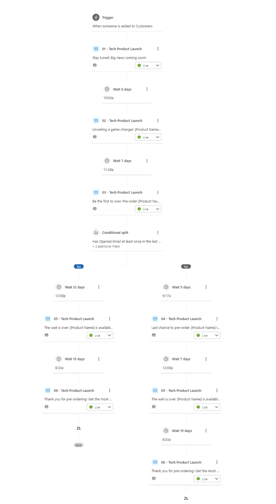
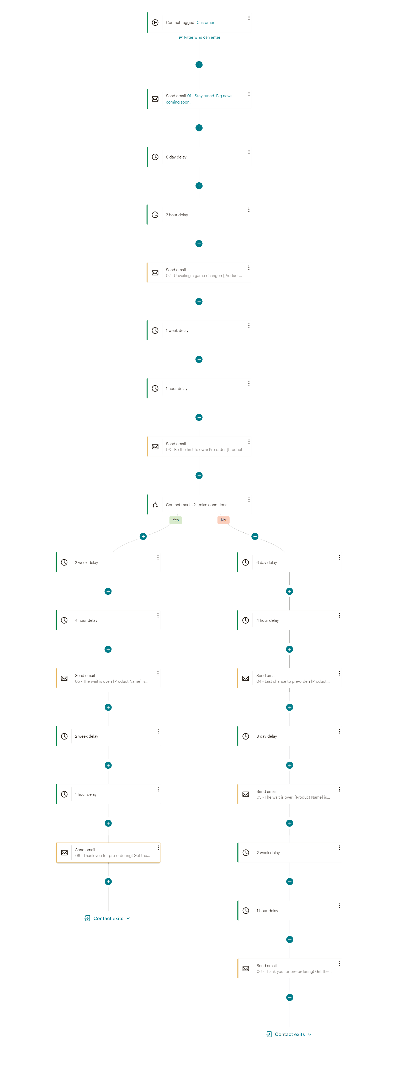
Recently, I had the opportunity to collaborate with a small business on their highly anticipated product launch. The company was eager to generate excitement among their customers, introducing them to a revolutionary new product before its official release and offering enticing pre-order incentives. While specific details remain confidential, I’m happy to share the general framework of the launch sequence I crafted:
The company’s overall goal was to drive pre-orders for its new physical product by generating excitement, educating its audience, and offering incentives. We created a 6-email sequence that includes three pre-launch emails, a launch day email, and a customer engagement email. For privacy reasons, I have changed the subject lines.
Timeline
- Email 1: Sent four weeks before launch (spark anticipation)
- Email 2: Sent three weeks before launch (sneak peek)
- Email 3: Sent two weeks before launch (pre-order)
- Email 4: Sent one week before launch. (launch week)
- Email 5: Sent on launch day. (launch day)
- Email 6: Sent two weeks after launch. (post-launch: create customer engagement)
Just like with abandoned cart emails and all marketing emails, personalization is key to driving customer engagement. For product launch sequences, A/B testing different subject lines to see what resonates best with your audience is a great idea. Additionally, employing cliffhangers, sneak peeks, and countdowns will help maintain customer anticipation. Social media promotion, running on a similar timeline as the email sequence, can also boost engagement.
Emails
Email 1: Sent four weeks before launch (spark anticipation)
Subject line: Stay tuned: Big news coming soon!
In this, our first email, we teased the new product without directly revealing its identity. Instead, we highlighted a major pain point it solves and generated curiosity, prompting customers to stay tuned.
Email 2: Sent three weeks before launch (sneak peek)
Subject line: Unveiling a game-changer: [Product Name] is coming!
In the sneak peek email, we unveiled the product name and showcased its key features through an image of it in action, directly addressing the pain point highlighted in the previous email. We also hinted at the upcoming pre-order availability, encouraging recipients to stay tuned for further details.
Email 3: Sent two weeks before launch (pre-order)
Subject line: Be the first to own: Pre-order [Product Name] now! (Early access)
The pre-launch email announces the product’s order date and time, showcasing the product, highlighting key benefits and features in detail, as well as offering exclusive pre-order incentives. While discounts were used in this instance, other options like limited editions or bonus items can be employed. Creating a sense of urgency by mentioning limited pre-order quantities was considered but not applied for this specific launch.
Email 4: Sent one week before launch. (launch week)
Subject line: Last chance to pre-order: [Product Name] launches next week!
As launch day approached, we sent a final reminder email highlighting the pre-order deadline and emphasizing the benefits of securing early access and guaranteed availability. The discount offered for pre-ordering was reiterated For pre-launch emails, if available, customer testimonials can be added to bolster trust and encourage action.
Email 5: Sent on launch day. (launch day)
Subject line: The wait is over: [Product Name] is available now!
Marking launch day, we sent customers a celebratory email featuring engaging visuals, a recap of the product’s key features and benefits, and limited-time discounts. To amplify excitement, we included shareable content for social media, allowing pre-order customers to contribute their positive reviews and generate external buzz.
Email 6: Sent two weeks after launch. (post-launch: create customer engagement)
Subject line: Thank you for pre-ordering! Get the most out of your [Product Name].
Two weeks post-launch, we sent a thank-you email acknowledging customers’ early adoption and providing helpful resources like guides, tutorials, and FAQs. To foster further engagement, we encouraged them to share their experiences through reviews and testimonials. While not applicable in this specific launch, events, workshops, or exclusive content related to the product would be valuable additions to further engage customers at this stage.
Customer Journey Automatization
Internal Email
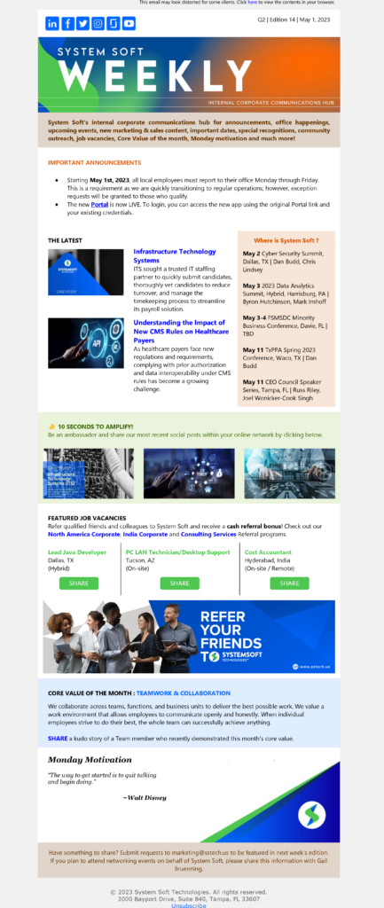
During my tenure at the company, we created an email that united two different internal emails. This was done to be respectful of employees’ time as well as decluttering their inbox. We also created three versions of the same email, as we needed to segment between salespeople, internal team and contractors.
System Soft Weekly was delivered every Monday at 11am ET, and provided the following information:
- Important Announcements: Here we added information about different important holidays, health awareness information, such as insurance, health tips, and initiatives for employees. This information helped employees stay healthy and informed about their health benefits and other valuable information.
- The Latest: This section includes information about new marketing campaigns, webinars, LinkedIn Lives, and other marketing resources.
- Amplify: This section includes information about how employees could amplify our marketing efforts through social media, email, and other channels, as well as three high-priority job opportunities to be shared by employees with their contacts, bringing in the opportunity to receive remuneration over the employee referral program.
- Where is System Soft? Provides recent and future events that the company was or will be involved in the recent past and future. This information is helpful for employees who may be interested in attending these events.
- Core Value of the Month: This section changed every month, providing information about one of the company’s core values. Employees were invited to provide stories about employees who proved they were the embodiment of such core values.
- Monday Motivation: Provides a motivational phrase and its author. This section was a great way to start the week off on the right foot, and we believed that it would help inspire our employees.
This internal email was a valuable resource for our employees and helped them to stay up-to-date on marketing initiatives, events, and job opportunities, as well as bring a reminder of our core values.
Segmentation
As mentioned earlier, our internal email had to be segmented in the following way:
- Salespeople: The links to whitepapers, blog posts, and reports that were shared with salespeople were from our CRM, to keep track of how and where our team was using them.
- Internal: All relevant information, from benefits to blog posts, job opportunities, both internal and external, whitepapers, reports, and events is available in this version. We could even add links into internal resources that were not available for contractors.
- Contractors: As our office expanded to different countries, we began using contractors, which had different access to information, as well as different benefits, so, not everything in the important announcement section was applicable to them, and we did not want for them to feel excluded.
