Data Analysis
Para la versión en español, de click aqui.
I recently completed the Google Data Analytics Professional Certificate offered on Coursera. This certificate program taught me about the six stages of the data analysis process: ask, prepare, process, analyze, share, and act. I also learned how to use technical tools such as spreadsheets, SQL, Tableau, and R.
To complete the course, Google recommends that each student create their own Capstone Project. This project allows students to highlight the technical skills they learned during the course and to showcase their understanding of each step of the data analysis process.
I chose to focus my Capstone Project on Email A/B Testing. I used the skills I learned in the course to collect data, clean it, analyze it, and create visualizations. I also shared my findings with others and discussed the implications of my results.
I am proud of the work I did on my Capstone Project. I believe that it demonstrates my ability to use data analytics to solve real-world problems. I am also confident that the skills I learned in this course will be valuable in my future career.
A/B testing, also known as split testing, is a method of comparing two versions of a marketing asset to see which one performs better. This can be a great way to determine what works and what doesn’t for your specific audience, and it can help you improve your marketing results.
To perform A/B testing, we would first need to create two versions of the same marketing asset. In the case of this dataset, we have two email versions, which are then served to a randomly assigned audience. This ensures that the results of the test are accurate and not skewed by any other factors.
Thanks to Gigasheet’s data and information on A/B Testing we will be able to look at this dataset, looking to analyze both groups, find out which email is more successful, and what it is that drives better conversion and engagement.
| Title | Marketing Email A/B Testing |
| Industry Focus | Marketing |
| Problem Statement | Which of the emails will bring a better click-through rate |
| Business use case (what are you solving for?) | Identifying the best options to drive conversion and engagement. |
| Goals / Metrics | Identify factors that are most effective at driving conversions and engagement. Discover the type of content that resonates with your target audience. Learn which version is highly likely to avoid the spam filter. |
| Deliverables | Graphics that prove the usefulness of the test and recommendations |
| Are datasets available? | Yes |
| Dataset list | Analyzing A/B Testing Email Marketing Data |
| Websites to scrape the data needed | https://www.gigasheet.com/post/a-b-testing-email-marketing-data-analysis |
Ask
The questions that we will try to answer and present as graphics in this case study are:
- What is the open rate for each version?
- What is the click-through rate for each version?
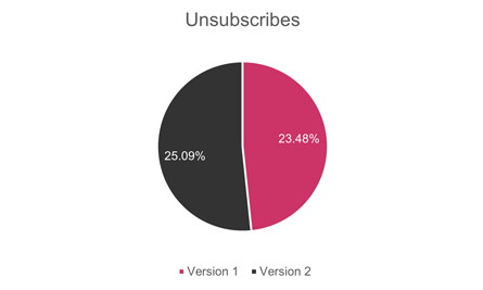
- What is the unsubscription rate for each version?
Prepare
The data was taken from Gigasheet’s data and information on the A/B Testing dataset. Per the article’s author, Ankit Vora, “Your marketing automation tool isn’t likely the best tool for data exploration and analysis. Therefore, you are going to want to export the data, and use a friendly spreadsheet format for analysis.” If the dataset can no longer be found, I have taken the liberty to download and keep it here, cleaned up, as it had identifying information.
Data Dictionary:
- Opened (Yes or No) – To understand the open rate of each version.
For the following, if an email is not opened, then, the response is null:
- Clicked-Through (Yes, No, Null) – To understand the click-through rate.
- Responded (Yes, No, Null) – To understand replies.
- Booked a Meeting (Yes, No, Null) – To understand meeting bookings.
- Unsubscribed (Yes, No, Null) – To discover which had the lowest unsubscription rate.
Process
I will be using Excel to analyze the data, as we will be using only 1000 entries. As there was personal information in the data (emails), this data was removed and changed to an ID number. There were many blank cells that were corrected to “no”. Those cells for rows with unopened emails were corrected from blank to null.
Analyze
After cleaning up the data, using filters and formulas we could find the following information:
Email Variation 1: 477 sent
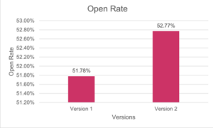
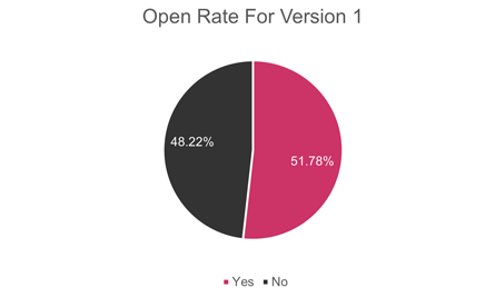
- Open Rate: 51.78% (247 emails opened)
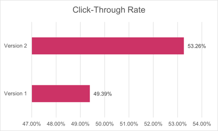
- Clicked-Through Rate: 49.39% (of 247 emails opened, 122 people clicked the CTA button)
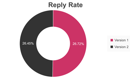
- Reply Rate: 26.72% (of 247 emails opened, 66 people responded)
- Unsubscribe Rate: 23.48% (58 people unsubscribed)
Email Variation 2: 523 sent
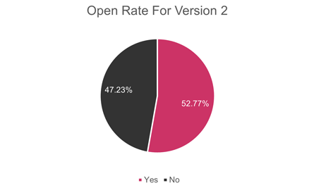
- Open Rate: 52.58% (275 emails opened)
- Clicked-Through Rate: 53.09% (of 275 emails opened, 146 people clicked the CTA button)
- Reply Rate: 26.55% (of 275 emails opened, 73 people responded)
- Unsubscribe Rate: 25.09% (69 people unsubscribed)
Share
We can see from the collected data, that the open rate for the second version is higher by almost one percentage point:
Each version holds a very good open rate, however, we can see more information for each on the following pie charts:
We can also find that the click-through rate is much improved with the second version’s CTA.
In the second version, the metric of unsubscribes is improved by over 1.5 percentage points.
However, something that I found interesting was that people replied to the first version more than to the second version. In this graph, we can see people who clicked on the reply button on their email and responded to what they received.
This is the only portion of the email that stands out in the first version versus the second.
Act
After conducting the A/B test of these two email versions, the results showed that the second version outperformed the first version in terms of engagement and conversions. The second version had a higher open rate, click-through rate, and conversion rate.
Call to Action analysis
The main difference between the two versions was the Call to Action (CTA). The CTA in the second version was more clear and concise and offered a more compelling offer. This led to more people clicking on the CTA and converting.
Reply analysis
An interesting point that I noticed was that the first version had a higher reply rate. This means that more people who received the first version actually responded to the email. We need to analyze the content of each email to understand why this is the case.
Conclusion
The second version of the email is the clear winner in terms of engagement and conversions. However, we need to analyze the content of each email to understand why the first version had a higher reply rate. This information could help us improve the overall performance of our email campaigns.
We need to keep in mind that the Call to Action (CTA) is one of the most important elements of an email campaign. A clear and concise CTA can make a big difference in the number of people who click on it and convert. It seems the CTA in the second version resonated better with the customers.
The content of an email can also have a significant impact on its performance. An email that is well-written and engaging is more likely to be opened, read, and replied to. We should take the most persuasive parts of the first version to include in the second version so that we can improve the reply rate.
It is important to analyze the results of A/B tests carefully. This information can help us identify what is working well and what needs to be improved.

